

The Fed’s dot plot dilemma
Even the nation’s top economists struggle to predict where rates are headed
5 min read
KEY POINTS
- The Fed’s dot plot provides insight into policymakers’ rate expectations, but history shows those projections can change dramatically.
- Wide differences among FOMC members’ long-term rate forecasts highlight the uncertainty surrounding the economy’s neutral interest rate.
- Investors who rely too heavily on Fed guidance may face unexpected risks when economic conditions force policymakers to change course.
The debate over the use and usefulness of the Fed’s “dot plot” continues. Our chart this week provides a look at the Federal Open Market Committee’s (FOMC) most recent iteration with lines that show the “central tendency” of the dots versus where the central tendency was when they last updated in June. Let’s start our discussion with what the dot plot represents.
There are 19 members of the Federal Open Market Committee. Of these 19, 12 are voting members and seven are non-voting members. All members are part of the discussions pertaining to monetary policy and provide their forecasts on items like gross domestic product (GDP) growth, unemployment and inflation. As part of that process, each member also provides their outlook for interest rates over the short, intermediate and long term. Based on these dots, the bond market can try to ascertain what the majority of the committee is thinking about the future of interest rates. There are no names assigned to each dot, although based on comments or speeches by FOMC members, we can generally get an idea of who is thinking what.
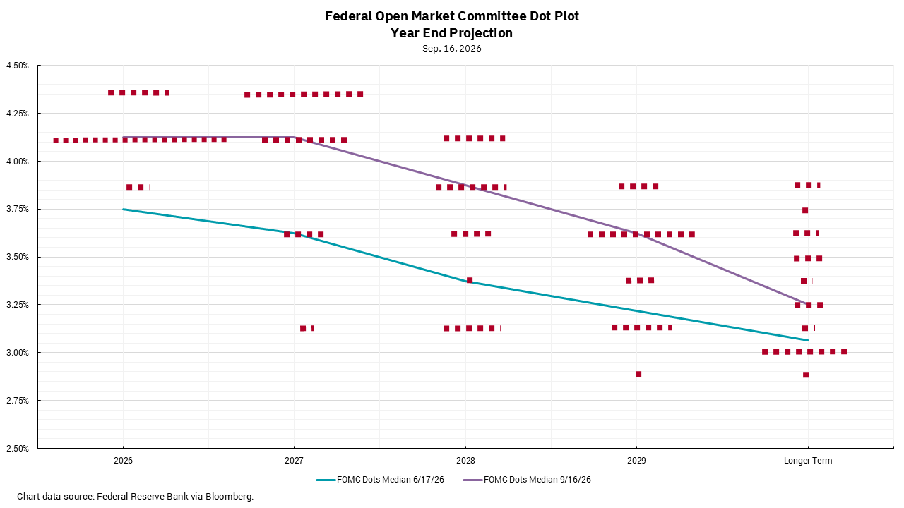
Immediate-past Fed Chair Jay Powell was adamant that the “dot plot” was not a forecast, but it was part of the “forward guidance” offered by the FOMC which impacted rates and capital markets. I have always been a bit fascinated by the dot plot for a secondary reason. The members of the FOMC are all highly intelligent and economically versed individuals. They have access to the best information possible, and the Fed employs hundreds of PhD economists who build incredibly detailed and complex econometric models. And yet, armed with all this, the dispersion in the rate outlooks is materially wide. Differences in the short run are generally less than the intermediate term, which is understandable, but the dispersion of the long-term forecasts shows a broad range of opinions on what the longer-term neutral rate, or R*, should be. To me, this always has been interesting. I would hope that the FOMC might have a better idea of what rate is neither accommodative nor restrictive for the U.S. economy than what the dot plot reveals.
There is another part of looking at this dot plot over time which is interesting. We came into this year with a dot plot showing the central tendency of the FOMC at that time was for two rate CUTS in 2026. The Fed just RAISED rates, and the new dot plot shows an outlook for another rate increase this year and the potential for another in 2027. This helps explain why former Chair Powell said this was not a forecast because, if it was, the forecast was dead wrong.
And here’s the problem: Markets already had built in this outlook for cuts. This means that, if an investor had decided to invest based on this outlook, they are now facing losses in their holdings.
In sum, Forward guidance from the Fed has proven to be less than accurate, so ending it would not necessarily introduce a new level of risk to the markets: it would just mean investors would demand compensation for a risk they are already taking. In short, as an investor, I want to be compensated for the risk I am taking, so in that sense, ending forward guidance is a good thing.
One last point, you might notice there are only 18 dots on this graph; Chair Warsh does not put his forecast on the dot plot. At least you cannot say he is wrong in his “forecast.”Get By the Numbers delivered to your inbox.
Subscribe (Opens in a new tab)